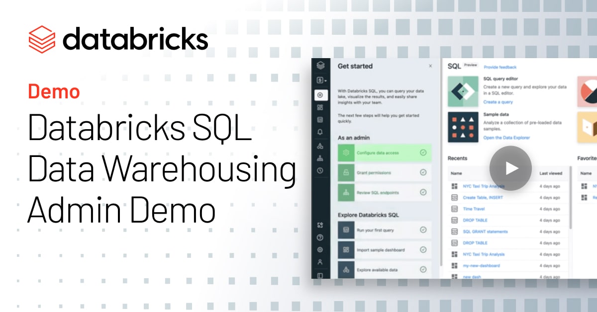
The first thing I always like to do is explore the data that I have available to me. So you’ll notice that here in the Data Explorer, I have a point and click way to understand the different catalogs, databases and tables that are part of my data lake. And here if I want to get a quick view of the different tables, I can get an overview of the schema, I can look at a few rows of sample data. Now of course, all this is stored in an open format, I can see details and I can even manage permissions with the click of a button. Now all the users and groups that you have within Databricks SQL can easily be synced from Okta, Active Directory, or a different authentication provider. What’s nice is in this Data Explorer, I can also see the history of my Delta tables so I can understand every operation that’s happened. Now today, we’re going to use the sample NYC Taxi dataset that we provide to you out of the box. But it is also worth noting that if you wanted to set up ingest from another source, you can do that with a partner like Fivetran with just a few clicks. Well, so let’s get started querying. So here, what you’ll see that we have is your SQL workbench. And this is where you author and execute queries. So let’s go ahead and run this sample one. Now, of course, you can have multiple SQL statements, whether those are ad hoc queries, or DDLs in each of these tabs. I’m also going to go ahead and pin this table since we’re going to use it throughout, while I can kind of go ahead through the schema browser and take a look at some of the other data that I have available to me.
Now, one thing to note is you can see here that I’m using the default SQL endpoint that comes out of the box with every workspace. But what’s great about these endpoints is that they eliminate the complexity of clusters, you don’t have to think about versions, you don’t have to think about Spark configuration. You just pick a t-shirt size, small, medium, large. And you can assign them to specific teams or departments. So you can streamline government governance and chargeback and soon with new Serverless Endpoints, you don’t need to think about startup time either ready for primetime in just a few seconds.
So now that we’ve got our results, why don’t we take a look at some of the execution details? You see here that we get a nice view of what actually happened. We can also understand some of the previous executions that we’ve run, and go back to a previous version if we’d like to. If we’re really firing on all cylinders, we can also go ahead and leverage any of these keyboard shortcuts, for things like opening and closing new tabs, or even executing our queries, highlighting certain portions, everything designed to make your analysis as quick and easy as possible. Now, of course, sometimes you don’t just want to generate results, you also want to visualize them and share them with other individuals and teams in the organization. So why don’t we go ahead and add a visualization. And you’ll see that’s right side by side with my with my results, let’s just do a quick scatterplot of the average fare by route, see if we can figure out which which routes we probably want to avoid, because they’re a little pricey. So you can see here, I was able to quickly just add that, that visualization. And I can quickly spot any of these outliers that I might want to avoid when I’m planning my trips – probably better to take the subway. So now this is great, I’m starting to generate some insights already. But what if I want to organize these insights per system and kind of come back to them time and time again with my team? Dashboards are a great way to do this. And of course, I’m sure you’ve guessed by now, we provide a number of sample dashboards out of the box. So let’s go ahead and pick our NYC Taxi one.
Now, you’ll see that this dashboard provides a great example of a number of capabilities you might want to take advantage of, whether that’s conditionally coloring certain values in a table, or adding interactivity via parameters and allowing the consumers of these dashboards to set different date ranges. And what’s great is if there’s a key metric I’m tracking like total trips, I can also right within Databricks SQL set up an alert so I know when certain thresholds are met. So here you’ll notice that I’ve selected my query total trips, I’ve decided I want to know as soon as we crossed that magical 300 mark for that time range. And we just want to get notified once when it happens. So I’m going to go ahead and create the alert. I’m going to tell it to send to myself. And I’m also going to go ahead and decide to make sure the entire team knows too, and make sure that message goes to Slack as well.
Alright, so with that, why don’t we jump over to Tableau where I’ve already configured it to query directly from Databricks SQL and to hit those SQL endpoints. You can see here that I was able to develop that same view of my data in a Tableau dashboard. And if I want to open anything up and do some additional analysis, like let’s say I want to understand kind of the difference in route fare by drop offs of code. You can see here that very quickly, I can see which zip codes are very close to each other. You can see very short trips, very cheap trips. But if I go a little further, I can also start to get some more insights and understand where the distance is actually a little longer. And this is all generating live queries against my Databricks SQL data, with the click of a button. So hopefully, this gave you an idea of what’s possible with analytics on the data lake whether you want to use our built in capabilities or your favorite BI tool.